Humble Grounds Coffee Roasters
Location: Shanghai, China
Client: Chen
Budget: $50K AUD
2025
Project Brief
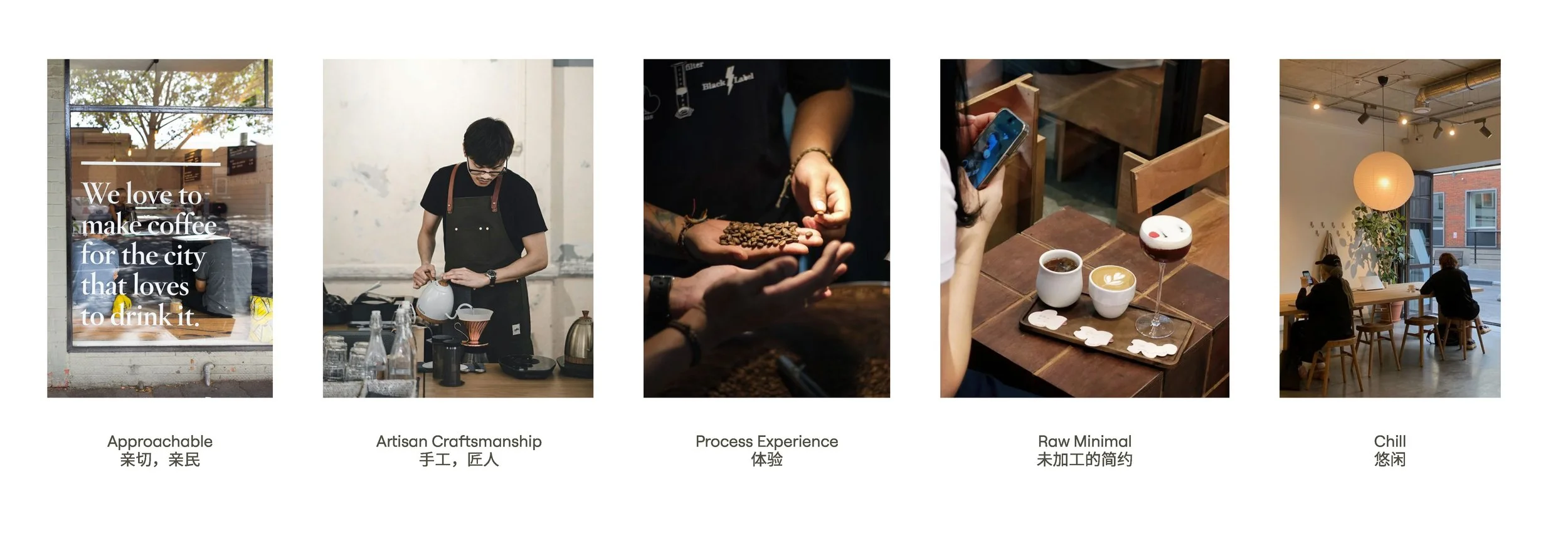
The client envisions Humble Grounds Roasters as a refined yet approachable specialty café with a touch of Melbournian character. Located in a vibrant shopping district surrounded by office buildings, the café is designed to stand out from well-established Chinese coffee chains. The concept is to foster community, connection, conversation, and coffee education, offering a unique experience through custom roasting for returning customers and an immersive hand-pouring experience.
Concept Development
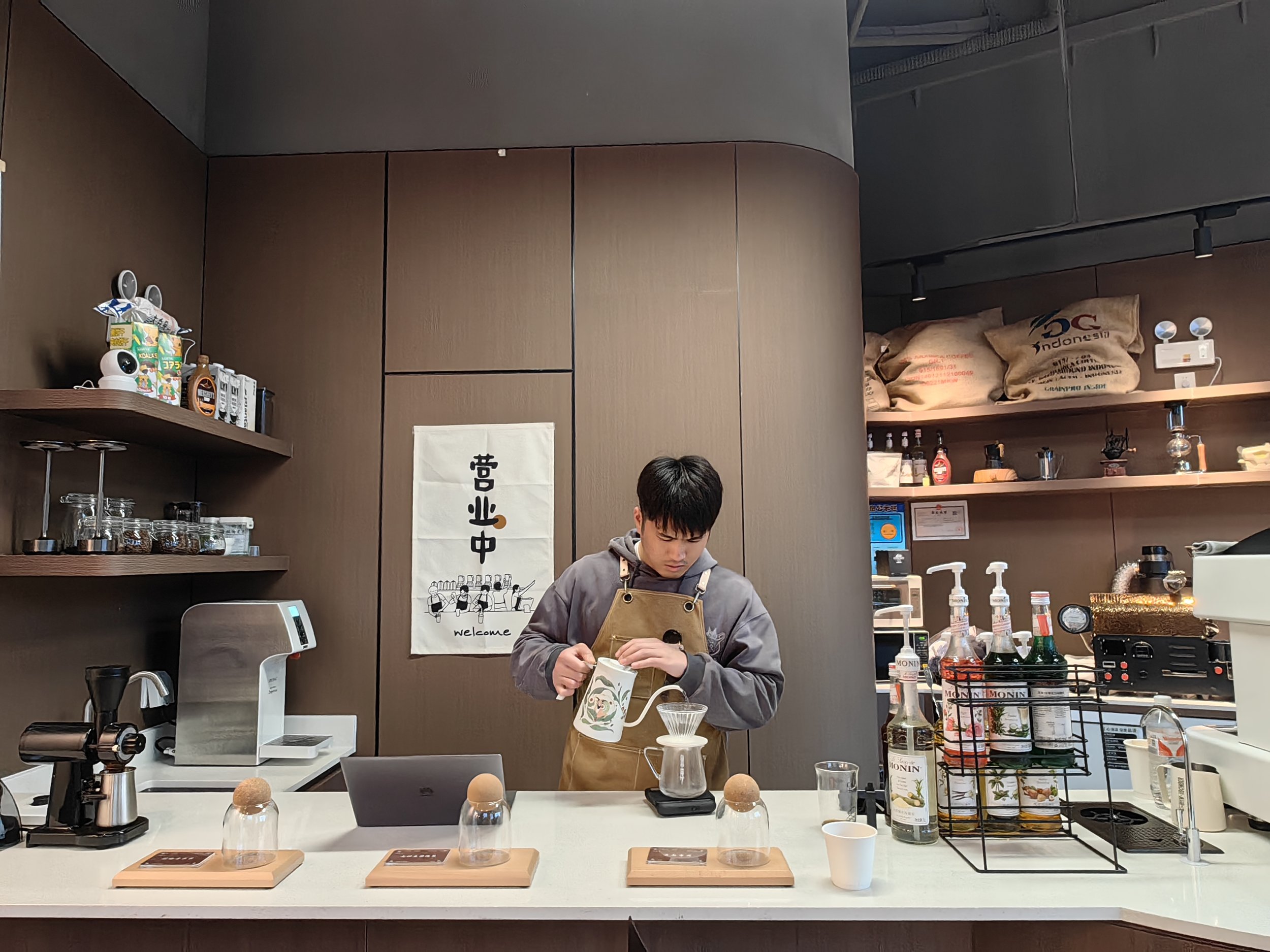
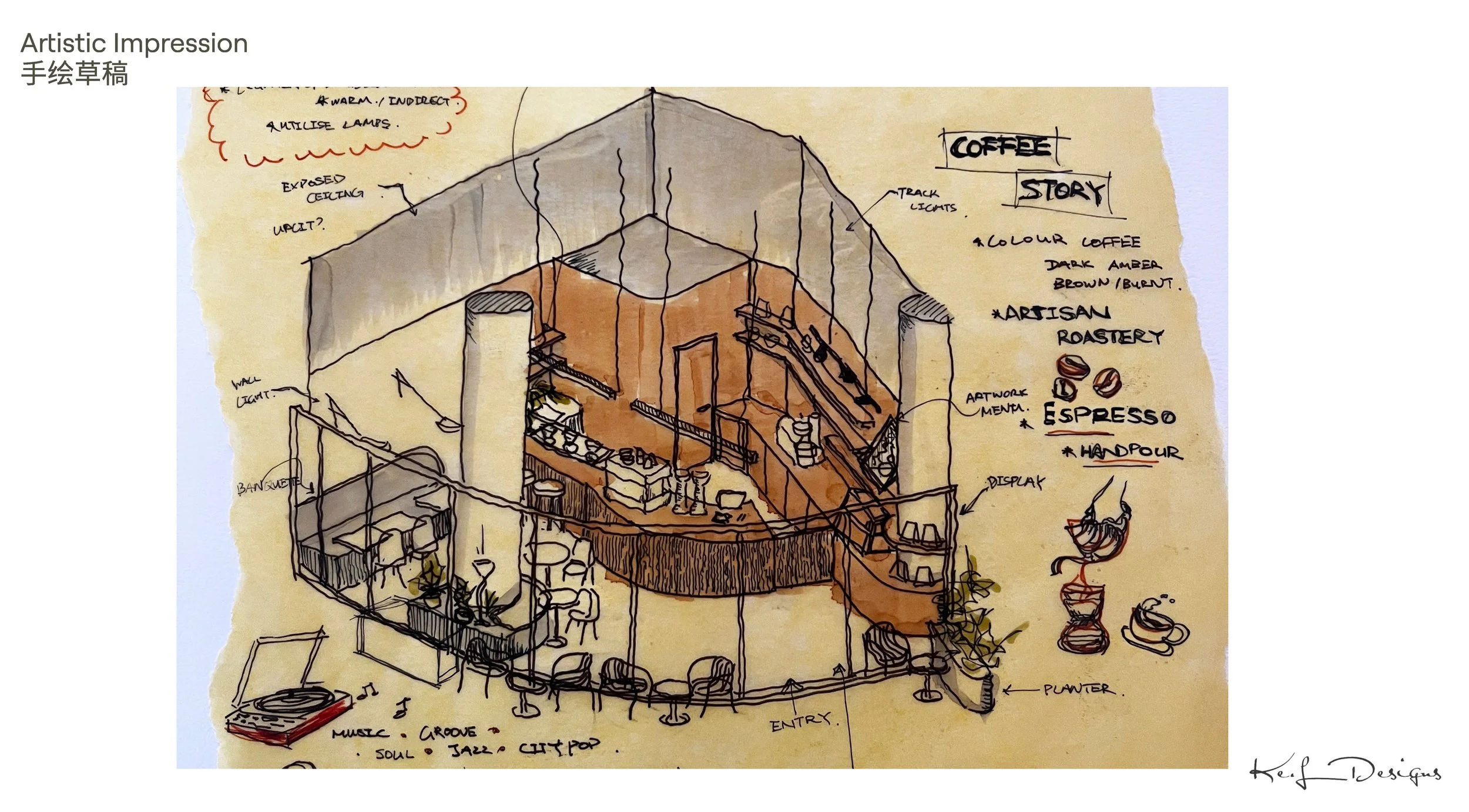
The interior design emphasises the craftsmanship of coffee roasting and providing customers with both visual and sensory engagement from the moment they walk in. Integrating the roasting machine into the main space instead of putting in a workshop area, allows the coffee shop to be filled with sounds and smells of the roasting process. An extended bar counter features a dedicated area for hand-pouring, where customers can sit down and experience tutorials on hand pour and coffee culture.
The client noted he prefered dark walnut timber to reflect the natrual colour of coffee brewing and coffee grounds. Contrasted with raw concrete finishes, sitting areas centered around the exposed colmun brings a touch of Melbourne’s coffee culture to the Shanghai scene.
With a relatively simple material palette, the client will introduce character through a curated collection of pop artworks and décor.
Concept Renders

Concept Render

Concept Render

Concept Render

Concept Render
Logo Design
With a growing demand for coffee amongst office workers in Shanghai, the growing market of chain cafés offering artificially flavored drinks and elaborate frappes has become extremely competitive. Humble Grounds re-centers the focus on the essence of coffee—its origin, process, and honest flavor. The branding is to reflects a return to the fundamentals: hand-poured, thoughtfully sourced, and shared among people.
Derived from a special decorative knot rooted in Chinese culture, the primary idea for the logo was to combine the letters ‘H‘ and lower case ‘g‘ into a pictogram that looks like two friends holding hands. Symbolising Humble Grounds to be the connection between home and work, between neighbourhood and community. The logo design reinforces the core concept of community, simplicity, and authenticity.


Marketing Video
Completion Photos